
Average Speed of Answer (ASA): What It Measures and How Enterprise Teams Hit Their Target
By Adom FrancisLast modified: November 17, 2026
Voted Top Call Center for 2024 by Forbes
Virtual Receptionists
Save time and money with our virtual receptionists.
AI Receptionist
AI-powered receptionist that answers, routes, and qualifies calls 24/7.
Enterprise Solutions
Solutions designed to scale with your organization’s needs.
Legal Services
Our virtual legal receptionists are experts in legal intake.
Last modified: November 17, 2026
Average speed of answer, often shortened to ASA, is the average queue answer time for answered calls or contacts. For enterprise contact centers, multi-location service businesses, legal intake teams, and healthcare access lines, it is one of the clearest ways to see whether callers are reaching a person fast enough when demand is high.
This article is for operators, contact-center leaders, revenue and intake owners, and executives who need a practical view of the speed of answer metric. You will learn what ASA measures, how to calculate it, what a good target looks like, how it differs from service level and AHT, and what enterprise teams do to improve it without damaging quality.
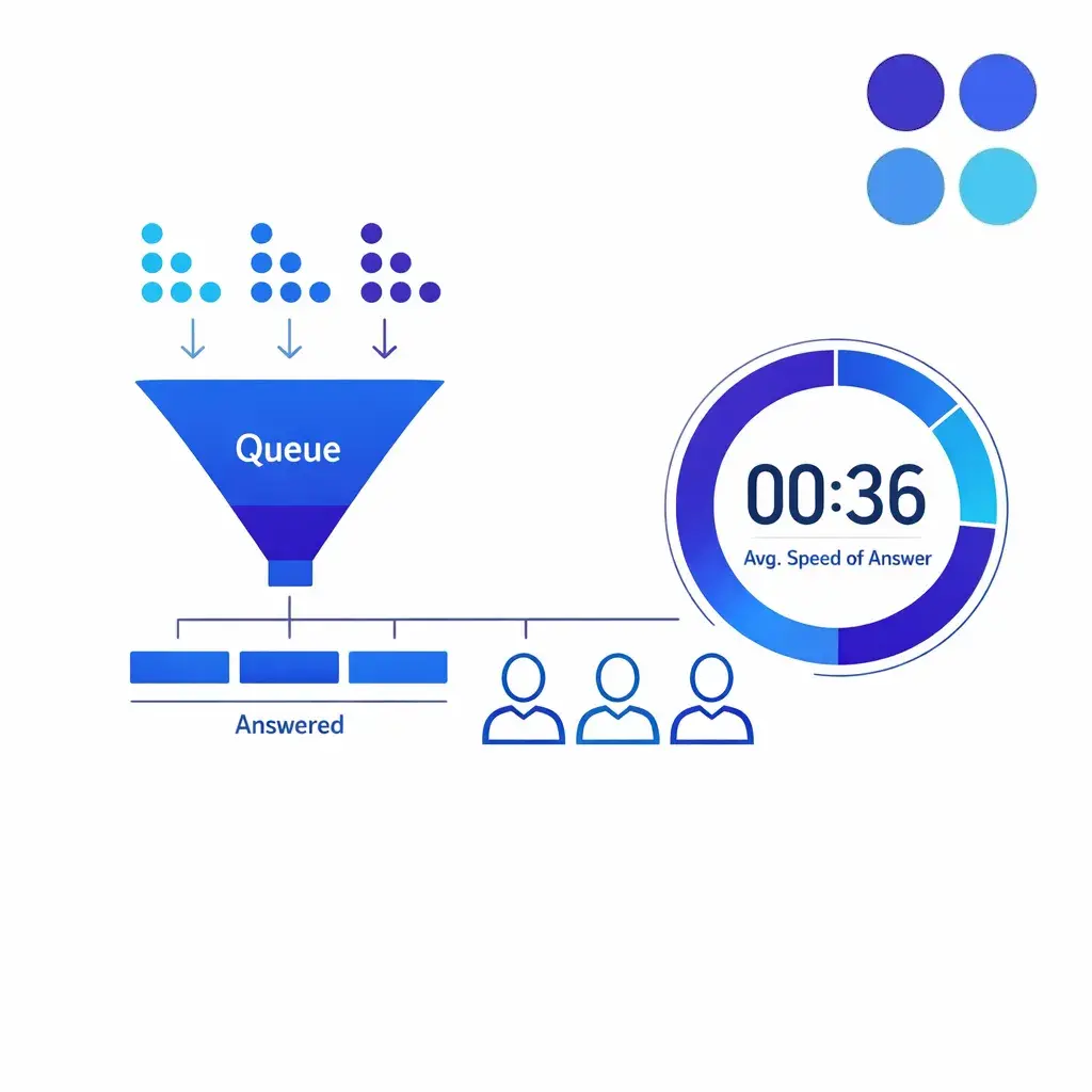
ASA is the average time answered callers wait in the live queue before reaching an agent. It gives a quick read on whether people reach a person fast enough when demand is high, especially for enterprise teams.
In plain terms, average speed of answer measures how long answered callers wait after entering the live queue before they reach an agent. In most contact-center reporting, pre-queue IVR time is treated separately, and abandoned calls are tracked outside the answered-contact metric set, so teams need to read their own platform’s metric definitions carefully before comparing dashboards or vendors.
That last point matters more than many teams expect. Two organizations can both say their ASA call center target is 20 seconds, but one may be reporting queue time only while another includes additional alerting or handling nuances. The label is common. The exact calculation logic can vary by platform.
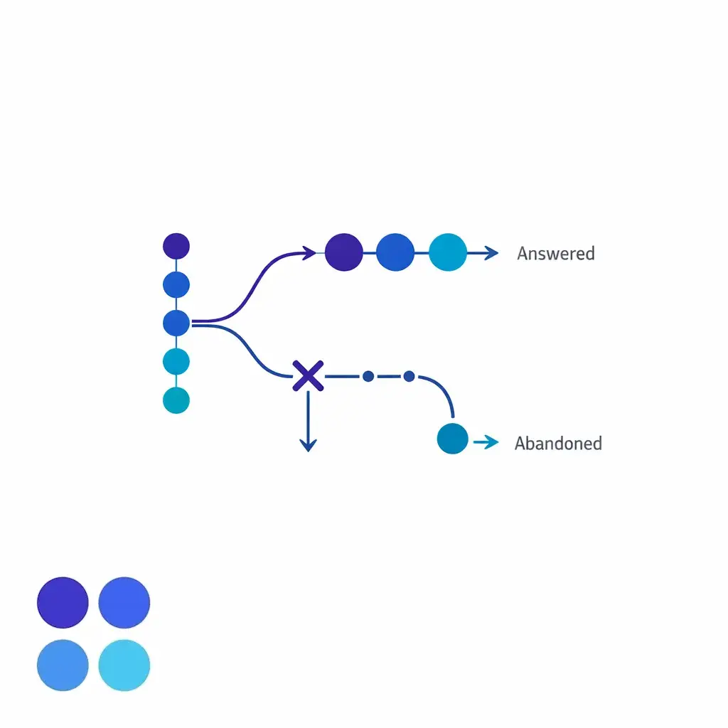
That is why ASA is useful, but also why it should never be treated as the only access metric. It tells you what happened for the people who got through. It does not fully describe what happened to the people who gave up.
ASA = total queue wait time for answered calls ÷ number of answered calls
That average speed of answer formula follows directly from standard queue-based contact-center reporting: you add the total wait time for answered contacts, then divide by the number of answered contacts. If 60 callers waited a combined 1,200 seconds before agents answered, the average speed of answer is 20 seconds.
The formula is simple. The hard part is making sure every report uses the same definition of wait time, the same answered-contact logic, and the same interval or queue scope. That is where enterprise reporting often goes wrong.
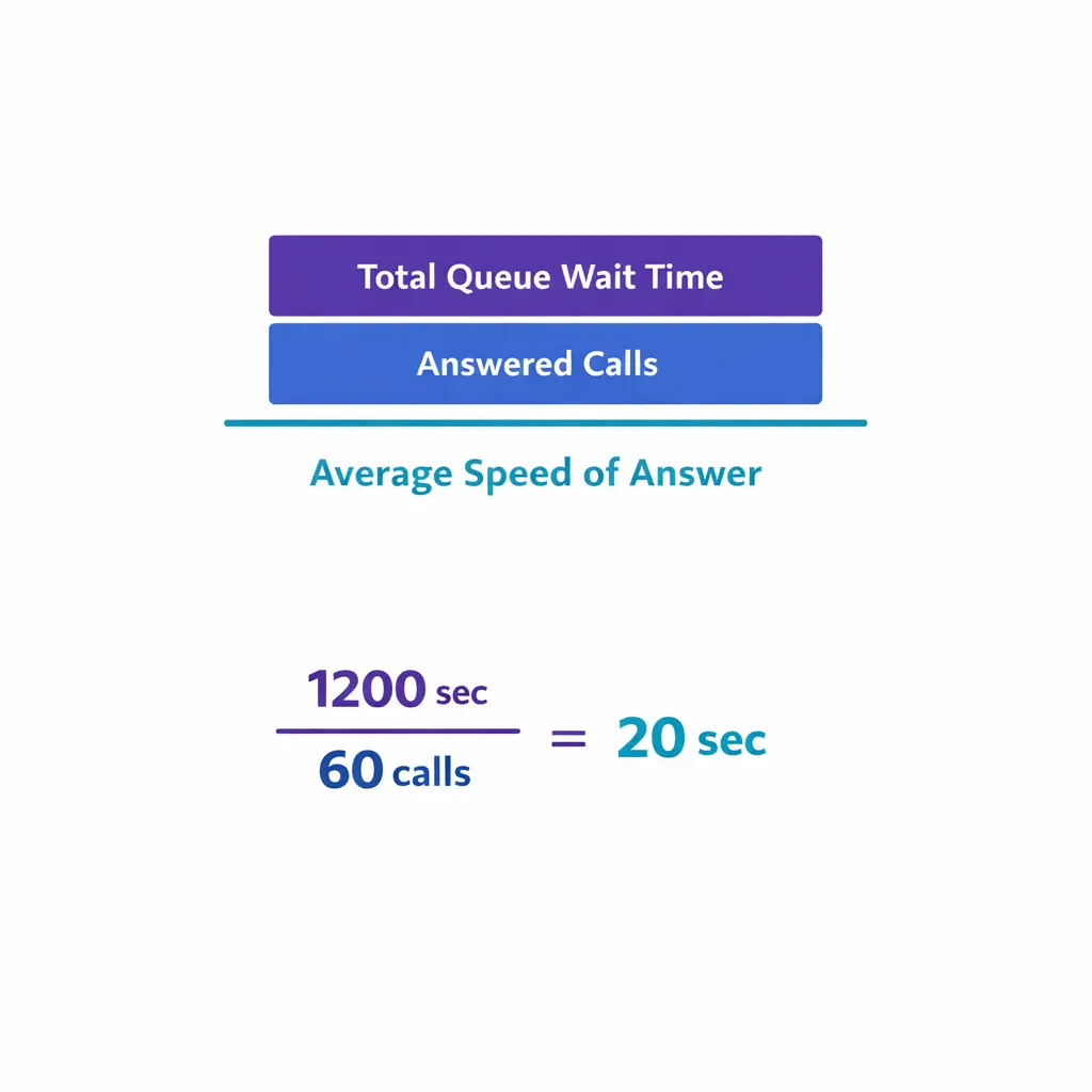
ASA equals total queue wait time for answered calls divided by the number of answered calls. For example, 60 callers waiting a combined 1,200 seconds gives an ASA of 20 seconds, provided every report uses the same definition.
Imagine one legal intake queue receives 100 calls in an hour. Agents answer 80 of them, and those 80 answered callers spend a combined 2,000 seconds waiting in queue. The ASA for that hour is 25 seconds.
Now imagine a second hour where agents answer only 50 calls, and those callers spend a combined 750 seconds waiting. The ASA looks better at 15 seconds, but performance may actually be worse if more callers gave up before connecting. That is why the speed of answer metric needs context.
There is no single call center ASA benchmark that fits every operation. Many teams still plan around the 80/20 service level convention, meaning the goal is to answer 80 percent of contacts within 20 seconds, but that is a planning shorthand, not a law of nature.
You will also see benchmark roundups cite ASA figures in the high-20-second range, including a commonly repeated 28-second number. Treat that kind of benchmark as directional only. A good average speed of answer depends on caller intent, queue type, staffing depth, hours of operation, and the cost of delay.
For enterprise teams, the better question is not “What is the universal good ASA?” It is “What answer-time target protects customer access, supports staffing efficiency, and matches the business value of this queue?”
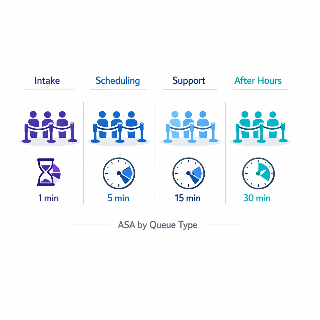
A good ASA depends on the queue. Urgent and revenue-generating queues justify tighter targets, while general support can tolerate a little more wait. The 80/20 convention is a planning shorthand, not a universal rule.
Service level and average handle time are different from ASA even though they are often discussed together. ASA is an average across answered calls. Service level measures the percentage answered within a defined threshold, such as 20 seconds.
That difference matters in real operations. A queue can post a respectable ASA while still missing service level because too many calls are landing just outside the threshold. The reverse can happen too if a large share are answered quickly but a smaller group waits far too long.
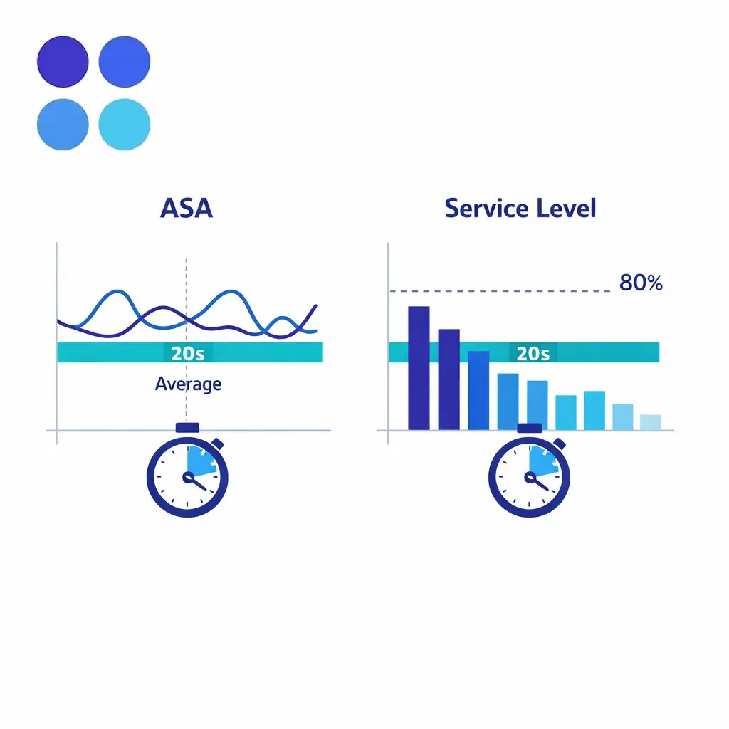
Average wait time is sometimes used as a synonym for ASA, but not always. Some reporting tools use “wait time” more broadly, so enterprise teams should align on the exact platform definition before comparing vendors, BPO partners, or internal dashboards.
If one dashboard includes only answered contacts and another mixes in abandoned interactions or different routing stages, the numbers may look comparable while measuring different things. That is a reporting problem, not an operations win or loss.
AHT, or average handle time, measures what happens after the answer: talk time, hold time, and after-contact work. ASA measures the wait before the answer.
The two still affect each other. If handle time rises because agents are searching for information, transferring too often, or documenting poorly, queue capacity tightens and ASA tends to rise. If leaders cut AHT too aggressively, they may create shorter calls but worse quality, more repeat contacts, or incomplete intake.
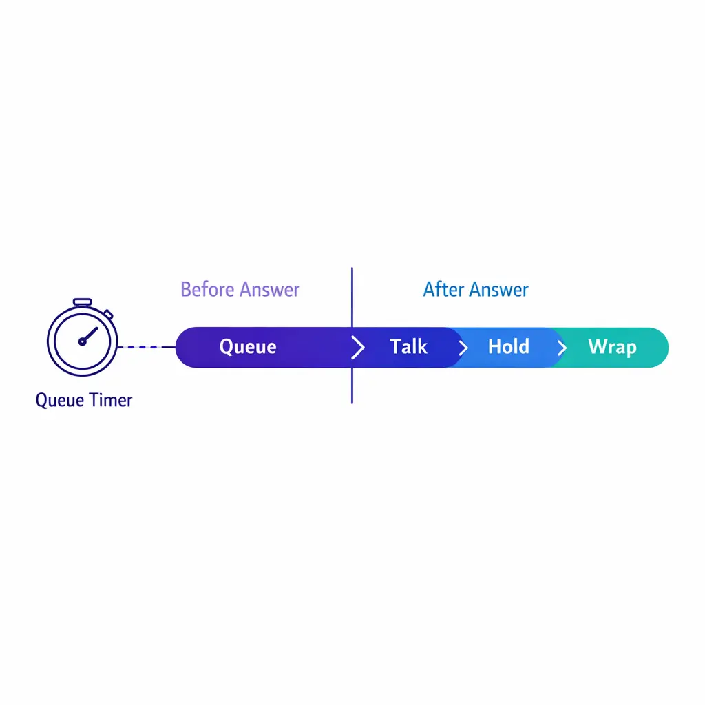
ASA measures the wait before the answer, while AHT measures talk time, hold time, and after-contact work. The two affect each other: longer handle time tightens capacity and pushes ASA up.
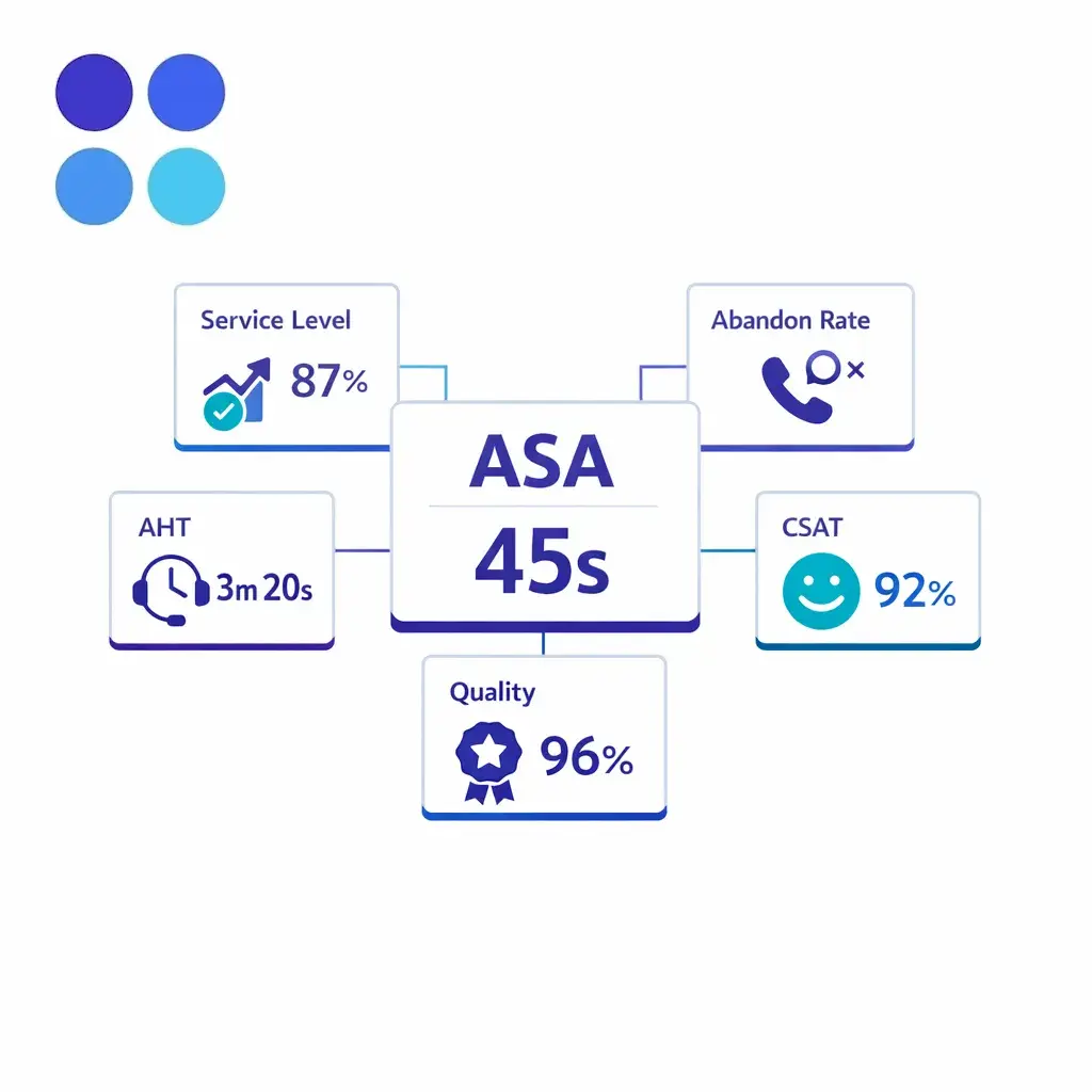
ASA tells you how accessible the queue feels before connection. Service level shows threshold performance. AHT helps explain how fast capacity turns. Add abandon rate, first-contact resolution, and customer satisfaction, and leadership gets a more truthful picture of access, quality, and efficiency.
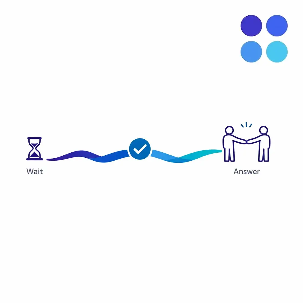
Wait time shapes the first impression of your operation. Longer waits create friction before the conversation even starts, which raises abandonment risk and lowers customer satisfaction. For legal intake and healthcare lines, that first moment of access builds or erodes trust.
ASA matters because wait time shapes the first impression of your operation. It also affects what happens next. When teams review answer performance, they should look at abandoned contacts alongside ASA, because faster answer for connected callers does not automatically mean the queue is healthy for everyone who attempted to call.
For multi-location service businesses, ASA affects whether locations stay reachable during uneven daily demand. For legal intake, it affects whether urgent prospects connect while intent is high. For healthcare scheduling and access lines, it affects whether patients reach staff quickly enough to keep trust in the practice.
High ASA is usually a symptom, not the root problem. Enterprise teams that improve it consistently tend to work backward from the operating drivers behind the queue, rather than treating the number as a standalone score.
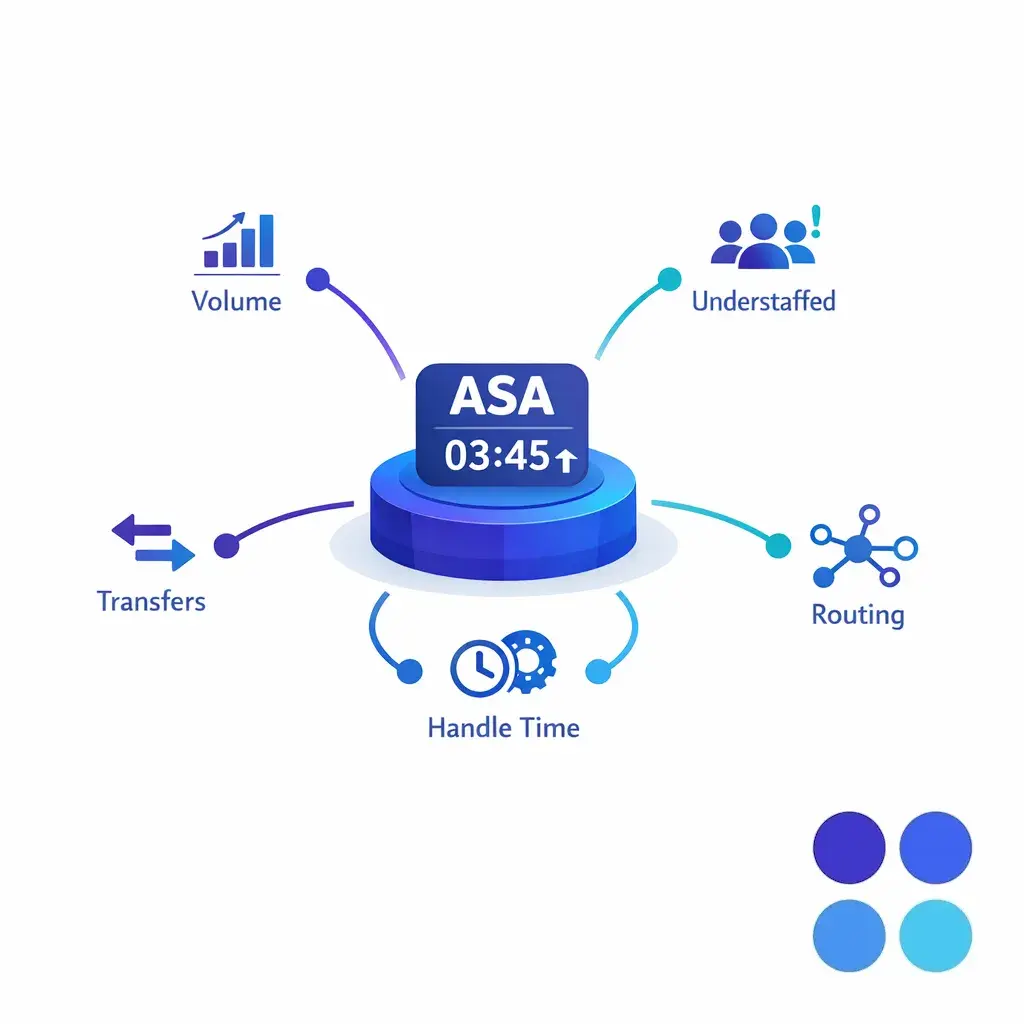
In practice, a high ASA usually comes from some combination of capacity, routing, and process design. That is why quick fixes rarely hold. Sustainable improvement comes from changing how the queue is run.
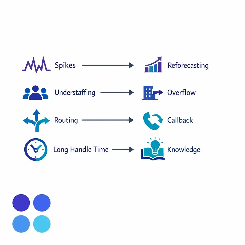
A high ASA usually comes from some combination of capacity, routing, and process design, so quick fixes rarely hold. Mapping each cause to a corrective action, such as staffing, routing, or knowledge changes, is what produces lasting improvement.
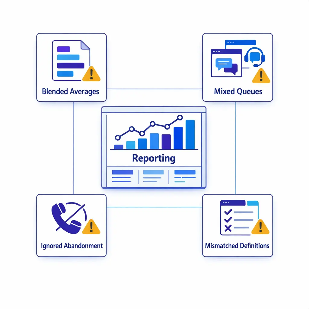
The formula for ASA has not changed, but the operating model around it has. Strong enterprise teams are moving away from one blended monthly score and toward queue-level, interval-level, and intent-level control.
They also manage answer speed across more coverage paths than before: internal agents, overflow teams, after-hours support, callback options, automation, and specialized intake functions. For many organizations, the question is no longer just “How fast do we answer?” It is “How do we stay reachable without losing quality when demand shifts?”
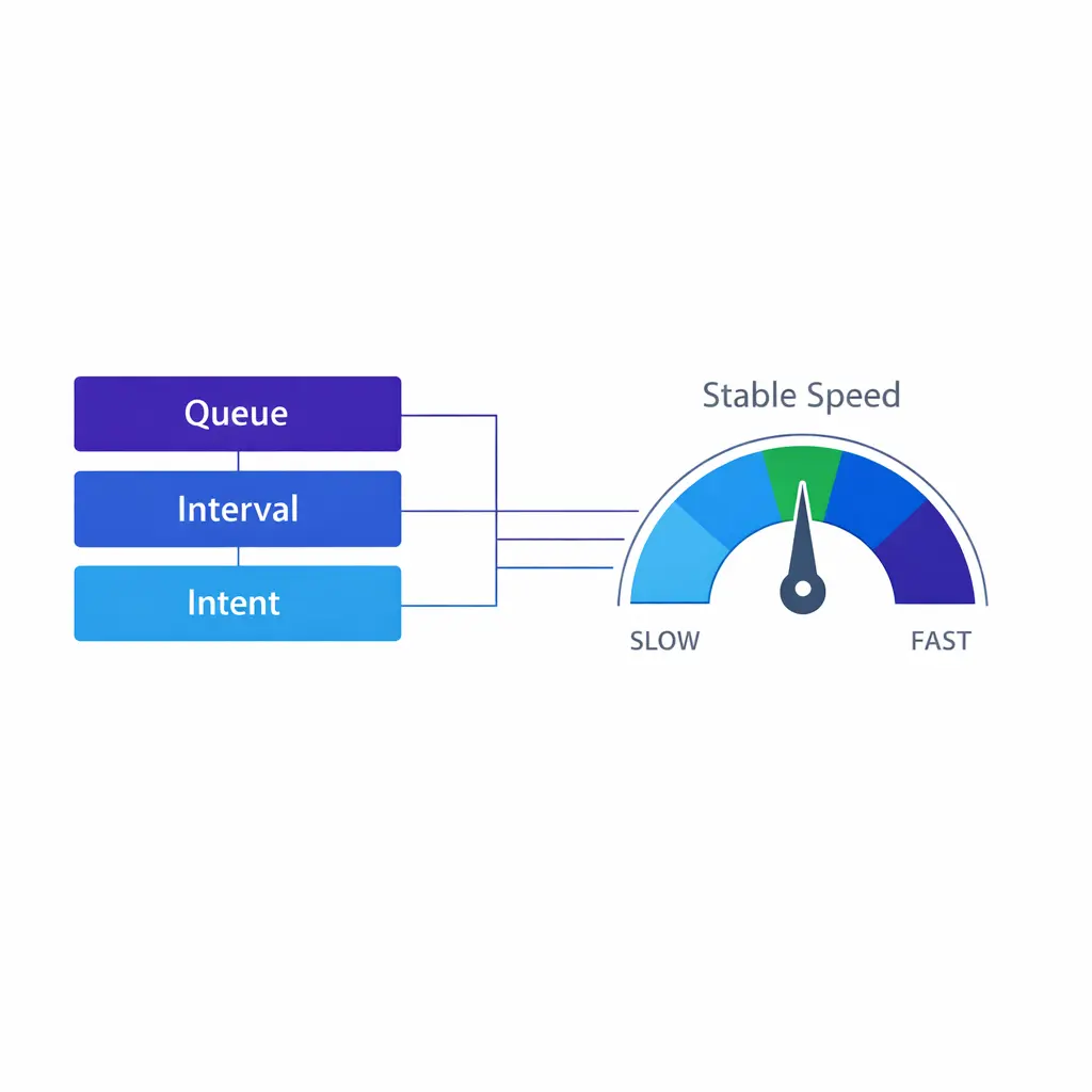
Forecast at the queue and interval level, not only by day or week. Review historical patterns by campaign, location, season, and event type. Then reforecast intraday when actual conditions move away from plan.
The goal is not perfect prediction. It is fast correction. Teams that monitor real-time variance early can reassign staff, trigger overflow, or adjust work allocation before the queue deteriorates.
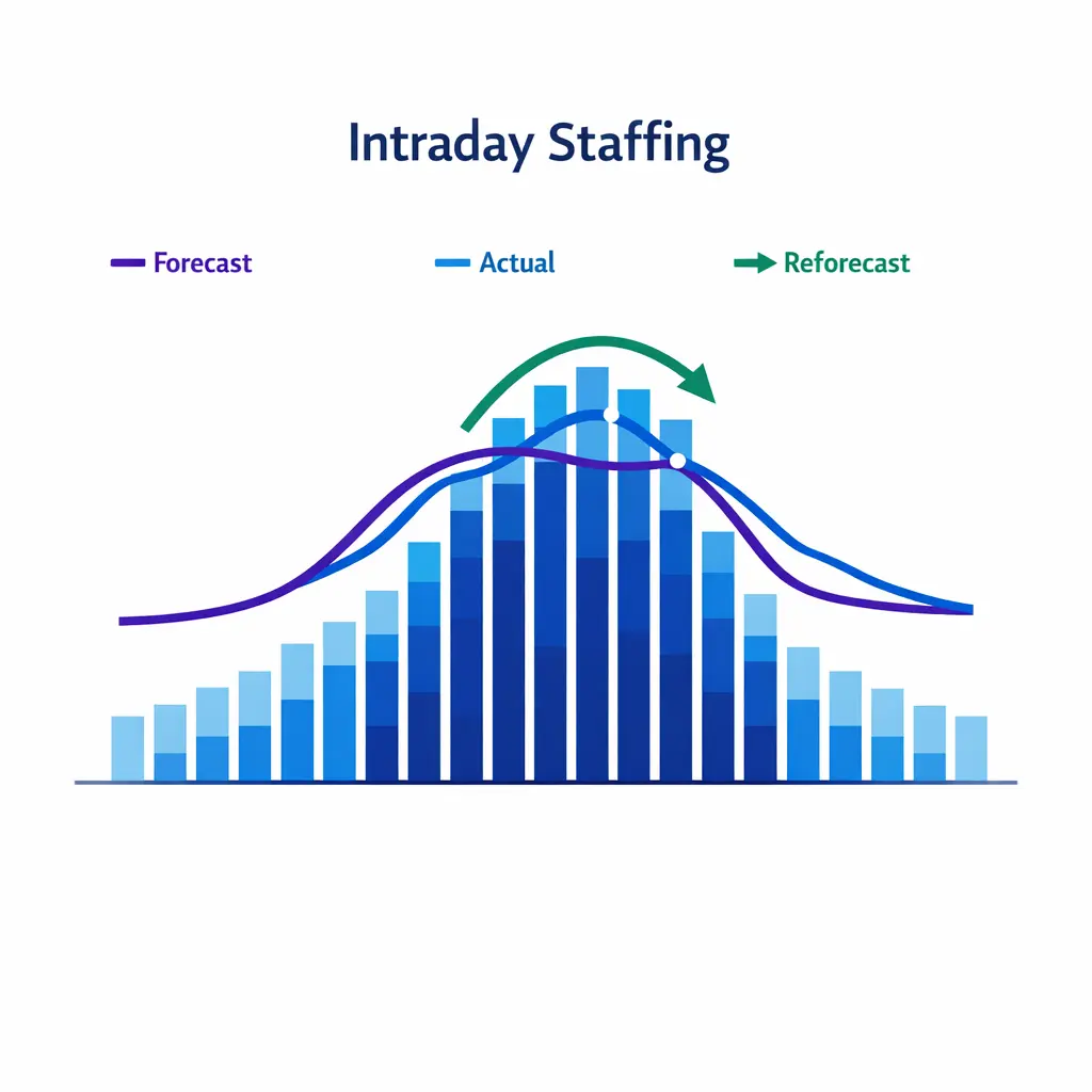
Forecast at the queue and interval level, then reforecast intraday when actual demand drifts from plan. The goal is fast correction: reassign staff or trigger overflow before the queue deteriorates.
Routing should reduce friction, not create it. Skill design that is too broad can hurt quality. Skill design that is too narrow can leave callers waiting for a tiny pool of agents while available capacity sits elsewhere.
Callback options can also protect the caller experience during short spikes. They do not solve a broken staffing model, but they can reduce the felt burden of waiting and preserve demand that might otherwise abandon.
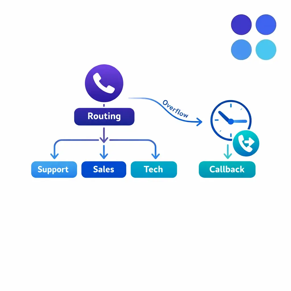
Good routing reduces friction. Skill groups that are too broad hurt quality, and ones that are too narrow strand callers. Callback options protect the caller experience during short spikes and preserve demand that might abandon.
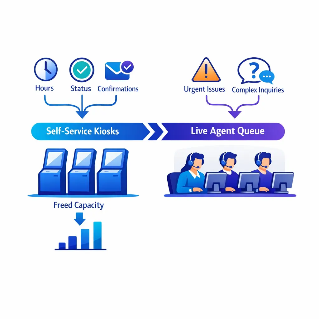
Every simple contact that stays out of the live queue frees agent time for higher-value work. Hours, status checks, confirmations, basic FAQs, and simple routing questions are often strong candidates for self-service.
The important distinction is purpose. Enterprise teams should not chase deflection just to reduce volume. They should remove low-value friction so trained staff can focus on urgent, complex, or regulated conversations where live judgment matters.
ASA is not only a front-of-queue problem. It is also a knowledge problem. When agents have clearer scripts, stronger intake forms, and faster access to answers, they resolve work more confidently and release capacity back to the queue sooner.
That matters especially in legal intake and healthcare environments, where consistency, completeness, and compliance awareness have direct operational value. Better guidance improves both speed and quality when it is implemented well.
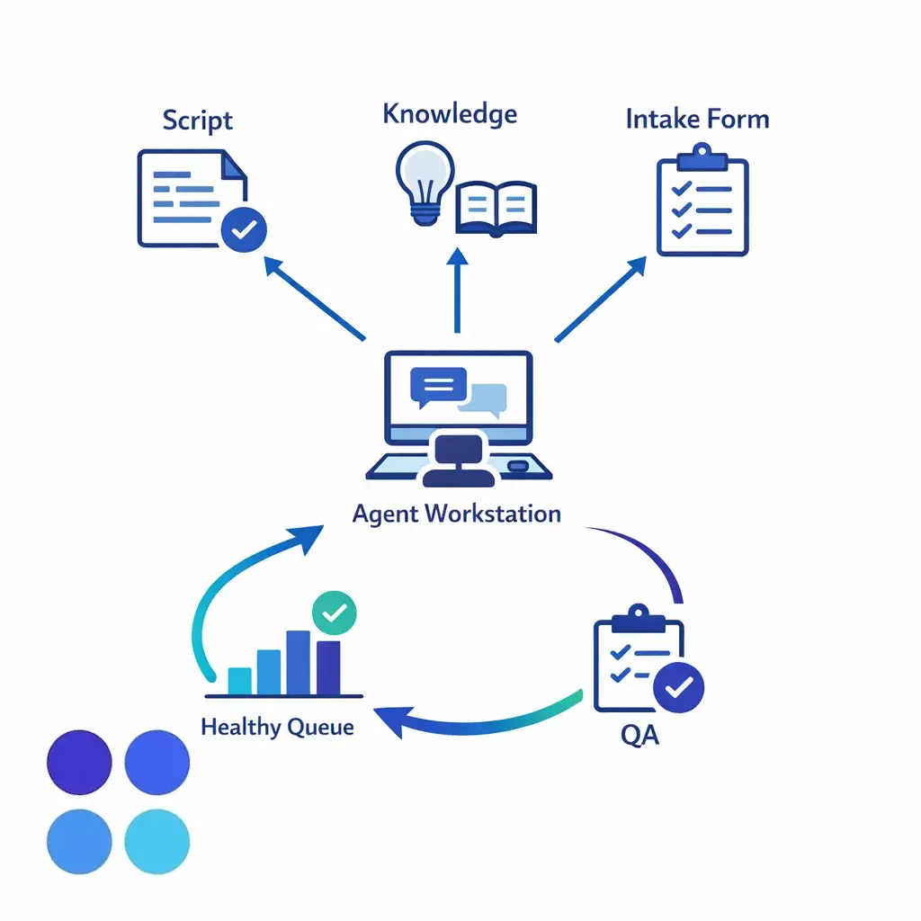
Clearer scripts, stronger intake forms, and faster access to answers help agents resolve work with confidence. That releases capacity back to the queue sooner and improves both speed and quality.
A blended average hides uneven customer experience. A queue can look fine on the month while still failing badly during lunch gaps, Monday surges, storm events, or handoffs between internal and overflow coverage.
Review worst intervals, longest waits, transfer-heavy scenarios, and queue segments with the highest abandon risk. That is where enterprise teams usually find the leverage to improve ASA in a durable way.
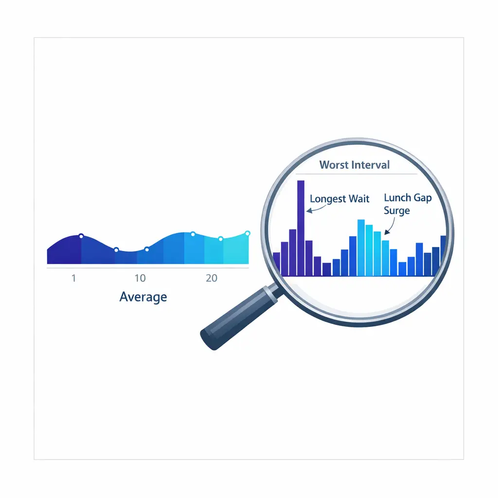
A blended monthly average hides lunch gaps, Monday surges, and handoff problems. Review the worst intervals, longest waits, and queue segments with the highest abandon risk to find durable improvements.
ASA should be reported as a decision metric, not a vanity metric. Leadership needs enough context to understand whether faster answer came from better operations or from hidden tradeoffs elsewhere.
This is also where external support models should be evaluated carefully. If a partner helps reduce ASA but creates weaker intake quality, more rework, or inconsistent caller handling, the organization has not really improved. Go Answer’s enterprise fit is strongest when teams need both coverage and disciplined execution.
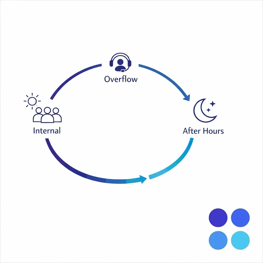
Document the overflow and after-hours path so answer-time goals stay realistic during peaks. Targets should match the coverage promise actually made to callers and clients. That keeps peak-period coverage honest and predictable for everyone involved.
How do you calculate average speed of answer? Add the total queue wait time for answered calls and divide by the number of answered calls. What is ASA in a call center? It is the average queue answer time for answered contacts. What is a good average speed of answer? Many teams use the 80/20 service level convention as a planning reference, but the right target depends on queue purpose and caller urgency. What is the 80/20 rule in a call center? It means targeting 80 percent of contacts answered within 20 seconds.
If your team needs stronger coverage, better answer performance, and more consistent intake quality across peak, overflow, or after-hours demand, Go Answer can help. Book a Discovery Call to discuss your queue design, explore enterprise BPO options, and see how a more resilient support model can protect access without sacrificing QA.

Learn why thousands of companies rely on Go Answer.
Try us risk-free for 14 days!
Enjoy our risk-free trial for 14 days or 200 minutes, whichever comes first.
Have more questions? Call us at 888-462-6793
Learn why thousands of companies rely on Go Answer.
Have more questions? Call us at 888-462-6793
If you would like to get in contact with a Go Answer representative please give us a call, chat or email.

Thanks for your interest!
A representative will be reaching out to you shortly.
Have more questions? call us on 888-462-6793
